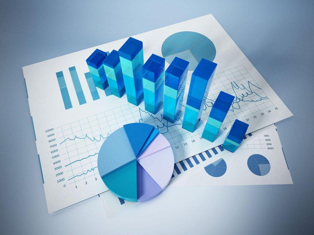
Excel is a powerful tool that enables users to create various charts and graphs to display and analyze data. With Excel, you can create charts for different types of data, including financial, statistical, and scientific data. Charts help users to understand and interpret data quickly and easily.
Excel has various types of charts that you can use, depending on the type of data you want to display. In this article, we will discuss the different types of charts in Excel and their uses.
Column Chart
A column chart is a graph that displays data in vertical bars. It is one of the most common types of charts in Excel, and it is used to display data that is organized in categories. Column charts are used to compare data across categories or to show changes in data over time. You can use a stacked column chart to display the contribution of each data point to the whole.
Line Chart
A line chart is a graph that displays data as a series of points connected by lines. It is used to display data that changes continuously over time, such as stock prices, sales figures, or temperature readings. Line charts are also used to show trends or patterns in data.
Pie Chart
A pie chart is a graph that displays data as slices of a pie. It is used to display data that is divided into categories and to show the proportion of each category. Pie charts are commonly used to show market share, budget allocations, and other types of data that can be easily divided into categories.
Bar Chart
A bar chart is a graph that displays data in horizontal bars. It is used to display data that is organized in categories, and it is similar to a column chart. Bar charts are commonly used to compare data across categories or to show changes in data over time.
Area Chart
An area chart is a graph that displays data as a series of points connected by lines, with the area below the line filled in with color. It is used to display data that changes continuously over time and to show the total value of a data series. Area charts are commonly used to show changes in sales figures or stock prices over time.
Scatter Chart
A scatter chart is a graph that displays data as a series of points. It is used to display data that is not related to time, such as the relationship between two variables. Scatter charts are commonly used in scientific or engineering applications to show the relationship between two sets of data.
Bubble Chart
A bubble chart is a graph that displays data as a series of bubbles. It is similar to a scatter chart, but it also displays a third variable as the size of the bubble. Bubble charts are commonly used to show the relationship between three sets of data, such as the relationship between sales, profit, and market share.
Stock Chart
A stock chart is a graph that displays the price and volume of a stock over time. It is used to display data that changes continuously over time and to show the performance of a stock over time. Stock charts are commonly used by investors and traders to make investment decisions.
Radar Chart
A radar chart is a graph that displays data as a series of spokes, with each spoke representing a different category. It is used to display data that is related to a central point, such as the performance of different products or services. Radar charts are commonly used in marketing and advertising to compare the performance of different products or services.
Surface Chart
A surface chart is a three-dimensional graph that displays data as a surface. It is used to display data that is related to three variables, such as temperature, pressure, and time. Surface charts are commonly used in scientific and engineering applications to show the relationship between three sets of data.
In conclusion, Excel offers a wide range of chart types that can be used to display different types of data. The chart types include column charts, line charts, pie charts, bar charts, area charts, scatter charts, bubble charts, stock charts, radar charts, and surface charts. Each of these chart types has its unique features and is used for specific data types and purposes.
Column charts and bar charts are commonly used to compare data across categories or show changes in data over time. Line charts are used to display data that changes continuously over time. Pie charts are used to display data that is divided into categories, and bubble charts are used to show the relationship between three sets of data. Scatter charts are used to show the relationship between two variables, and surface charts are used to display data related to three variables.
It is important to choose the right chart type that best represents the data being presented. This will help to ensure that the data is effectively communicated and understood by the target audience. Excel’s charting capabilities make it a valuable tool for data analysis and presentation.


